
Our Visualizations bring the Worcester Regional Research Bureau’s independent, nonpartisan research to life with interactive tools that make complex data easier to explore. Alongside our written reports, you’ll find StoryMaps that guide you through place-based narratives, ArcGIS web maps you can pan and zoom to see neighborhood patterns, and dashboards with filters, sliders, and tooltips so you can focus on what matters to you. Many include hoverable charts, toggleable layers, and clear legends, and most are mobile friendly, accessible, and updated as new data becomes available.
These visuals complement our traditional publications by helping you explore trends, compare geographies, and spot relationships before diving into full findings and recommendations. Each visualization links back to the underlying research for context, sources, and methodology, so you can move from quick exploration to deeper analysis with confidence. Whether you are a policymaker, community partner, reporter, or resident of Central Massachusetts, our maps, dashboards, and stories turn public data into practical understanding, grounded in evidence and built to support informed decisions.
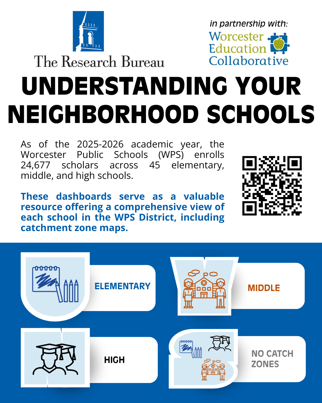
The 2026 Update of Understanding Your Neighborhood Schools dashboards, developed by Worcester Regional Research Bureau in partnership with Worcester Education Collaborative, use 2025-2026 enrollment data for the Worcester Public Schools, MSBA 2025 survey data, as well as data from the 2024 5-YR American Community Survey to provide interactive dashboards that serve as a valuable resource for families, policymakers, and educators, offering a comprehensive view of each school in the WPS District.
The Opportunity Zone (OZ) program uses federal tax incentives to encourage private investment in low-income communities and was made into a permanent, decennial program through the One Big Beautiful Bill Act of 2025 (OBBBA). This brief shifted attention to the next round of OZ designations. The Healey-Driscoll Administration nominated 13 census tracts in Worcester County which are awaiting certification by the U.S. Department of the Treasury.
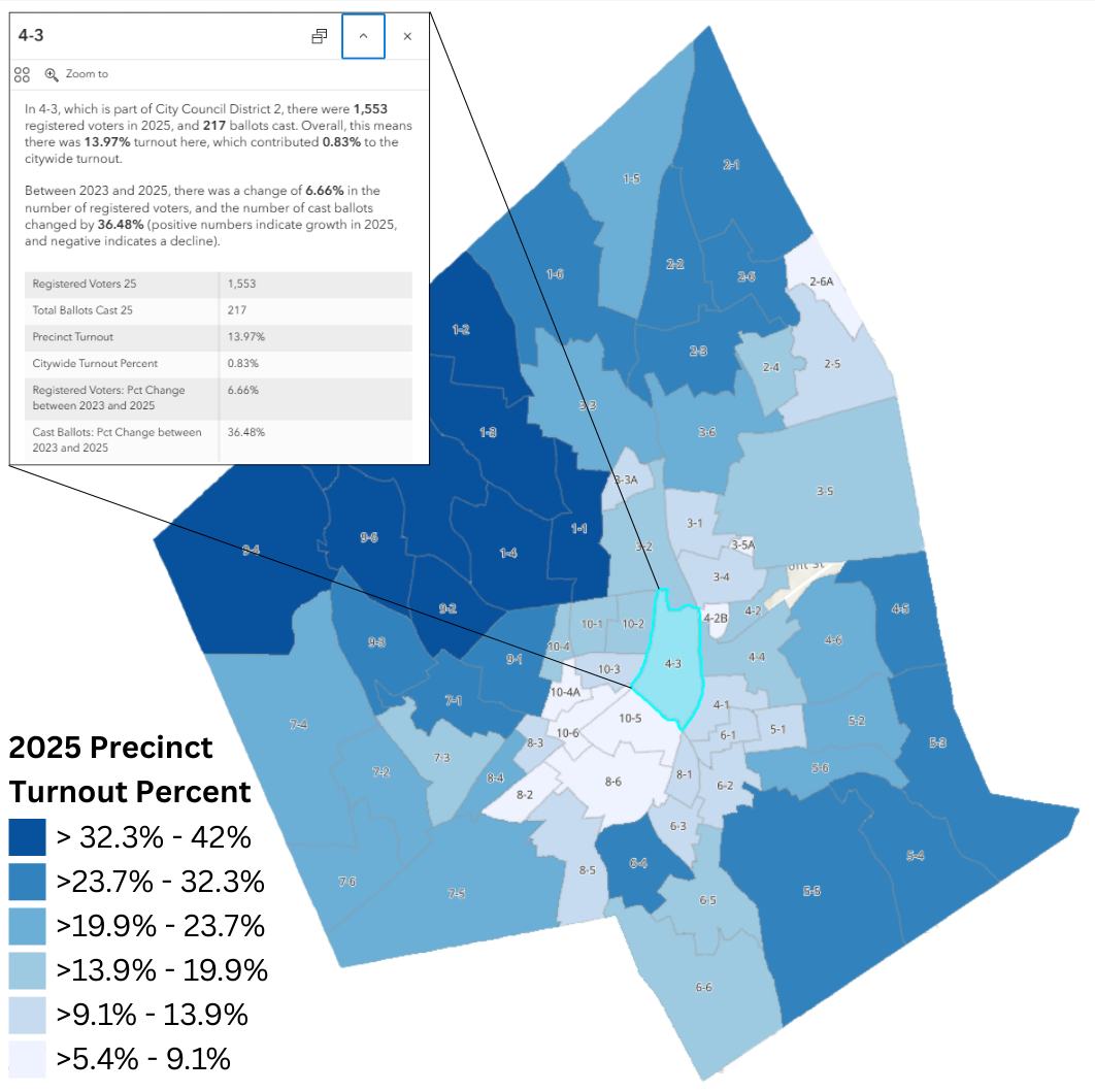
The Worcester Regional Research Bureau has long analyzed data on elections and voting in Worcester. This dashboard continues by analyzing November 2025's municipal results. This series of maps of the results of Worcester's 2025 municipal election, are organized into "overall" and "district" and "at-large" elections. In general, there are maps for each of the candidates that won an election, but clicking on individual precincts will give information about vote margins, comparisons to 2023, and all other candidates in the election.
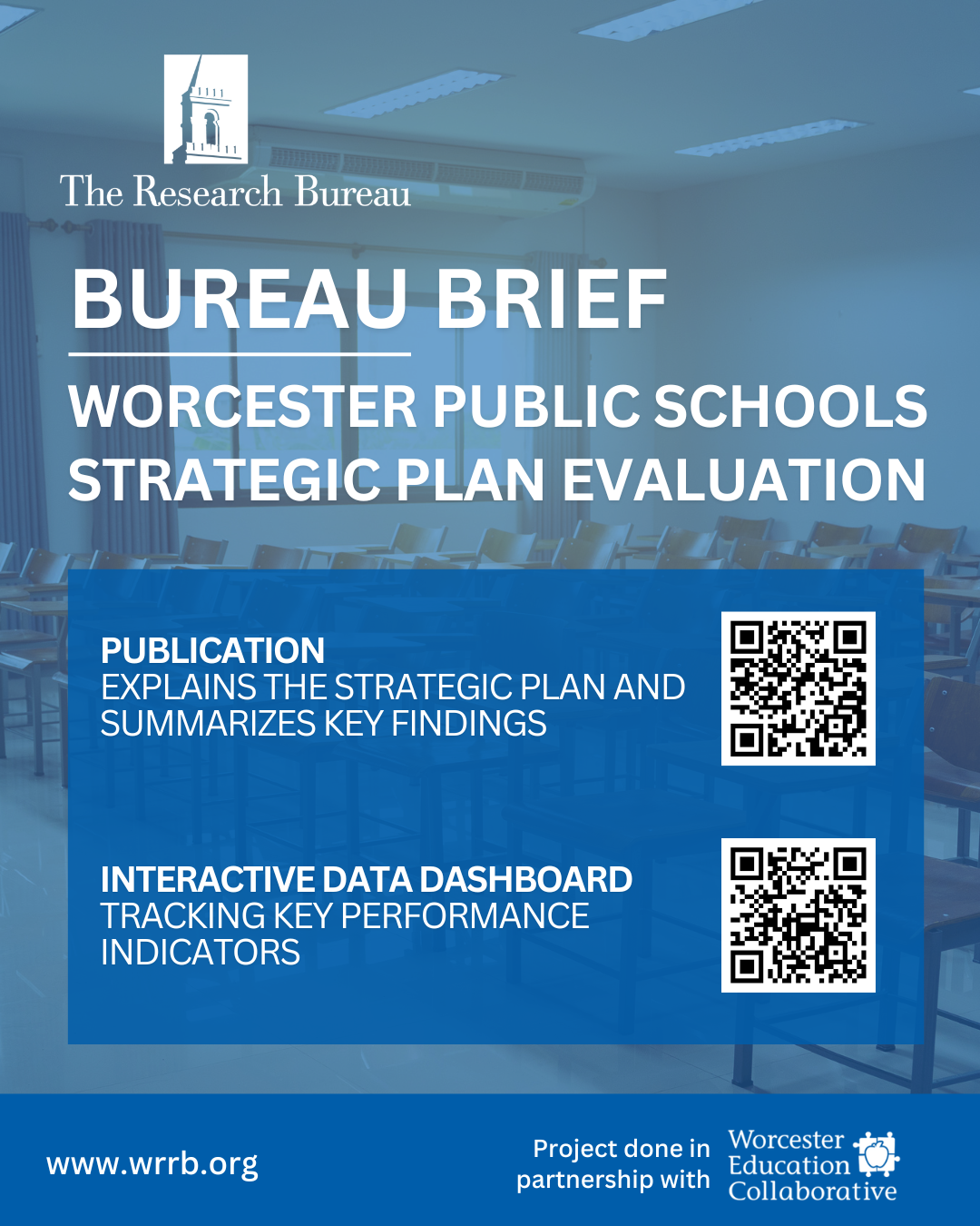
Worcester Regional Research Bureau in partnership with Worcester Education Collaborative (WEC) developed an interactive Tableau dashboard that displays progress on Our Promise to the Future, the Worcester Public Schools’ 2023–2028 Strategic Plan. The dashboard is designed to help the public understand progress to date on the district’s more than 50 performance indicators. The accompanying brief explains what the strategic plan is, how it was created, and summarizes key findings form the district’s early progress monitoring data.
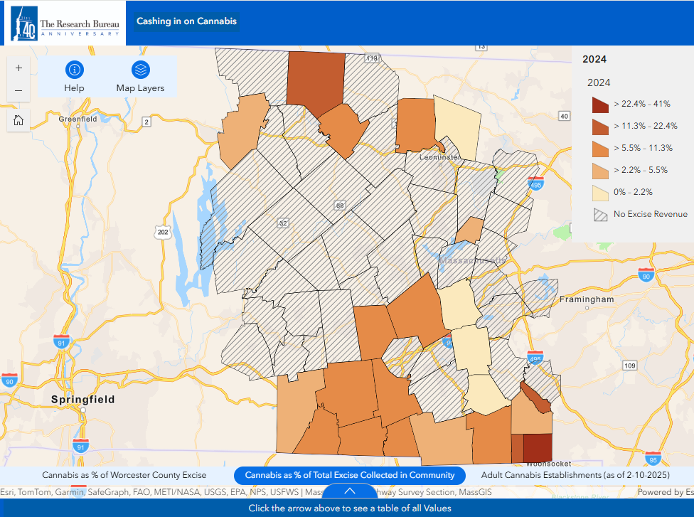
In collaboration with the Worcester Business Journal, "Cashing in on Cannabis" shows the growth of excise tax collection on cannabis sales across Worcester County.
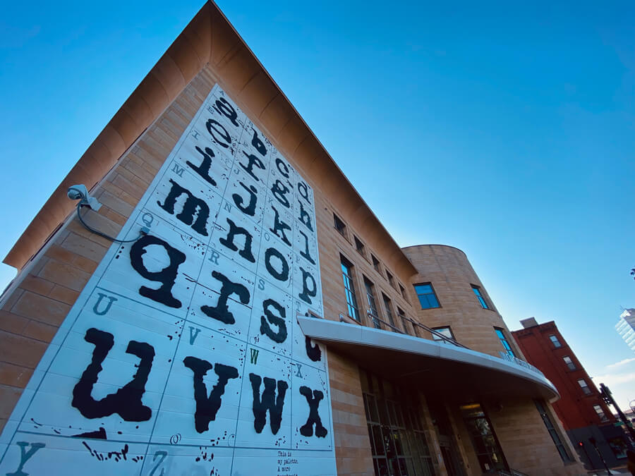
The Worcester Public Library (WPL) has been in continual existence since late 1859, when the City Council adopted an ordinance to establish it and accept a gift from Dr. John Green III and the Worcester Lyceum and Library Association of 7,000 and 4,000 books respectively.
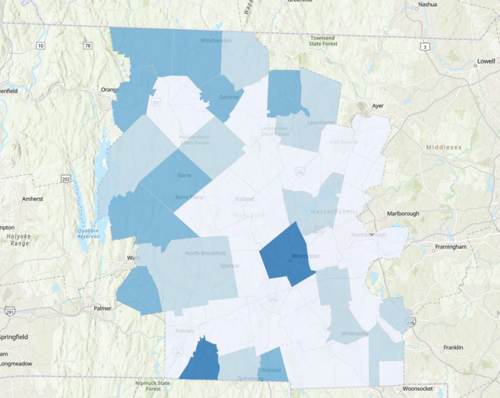
The inaugural edition of Insights Insider, “Introducing Worcester County Insights”, explores the datasets that are used in the dashboard, highlights the dashboard's useful features and sample visualizations, and notes its value to specific stakeholders such as municipal officials, not-for-profits, businesses, community or advocacy organizations, higher education institutions, and more.
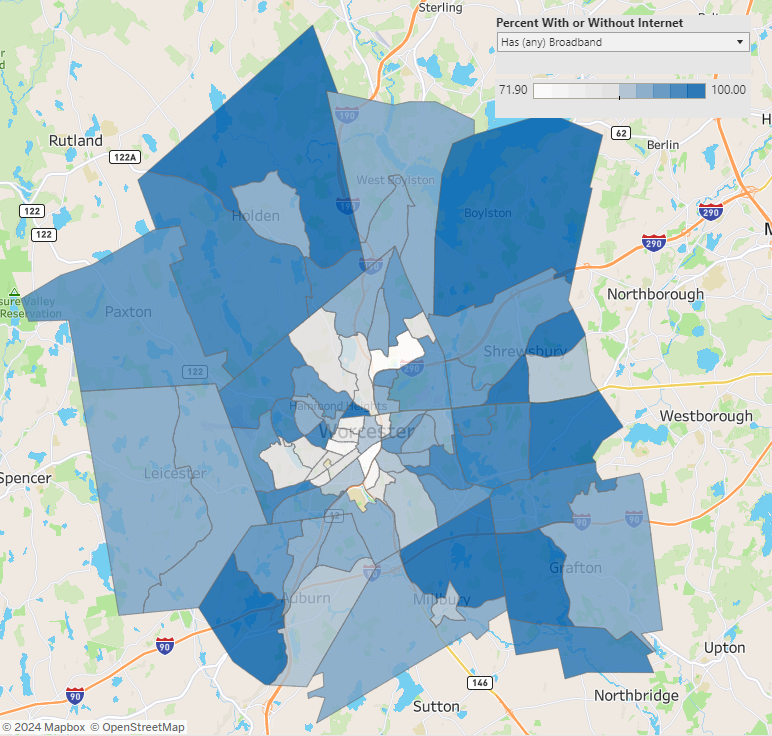
The WRRB's Broadband Explorer is an interactive tool to show broadband status and other selected data on a Census Tract by Census Tract basis (or Zip Code if only available) for households in Auburn, Boylston, Grafton, Holden, Leicester, Millbury, Paxton, Shrewsbury, West Boylston, and Worcester.
Introduction: As of the 2023-24 academic year, Worcester Public Schools (WPS) enrolls an impressive 24,350 scholars across 45 elementary, middle, and high schools collectively.
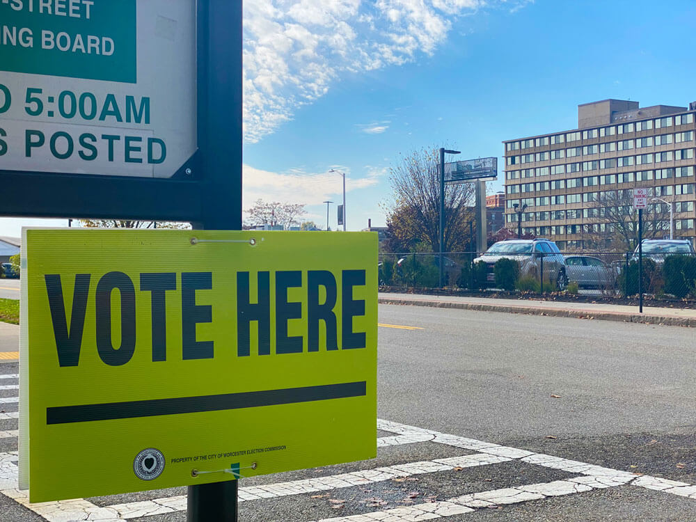
This StoryMap presents Worcester's preliminary and general municipal elections between 2013 and 2023, with a special focus on individual races in 2021 and 2023.

Over the past few decades, the City of Worcester has undergone substantial demographic and economic changes. As an economic and population hub in central Massachusetts, studying past changes helps us to better understand the current regional conditions and to think in a more informed way about the future.
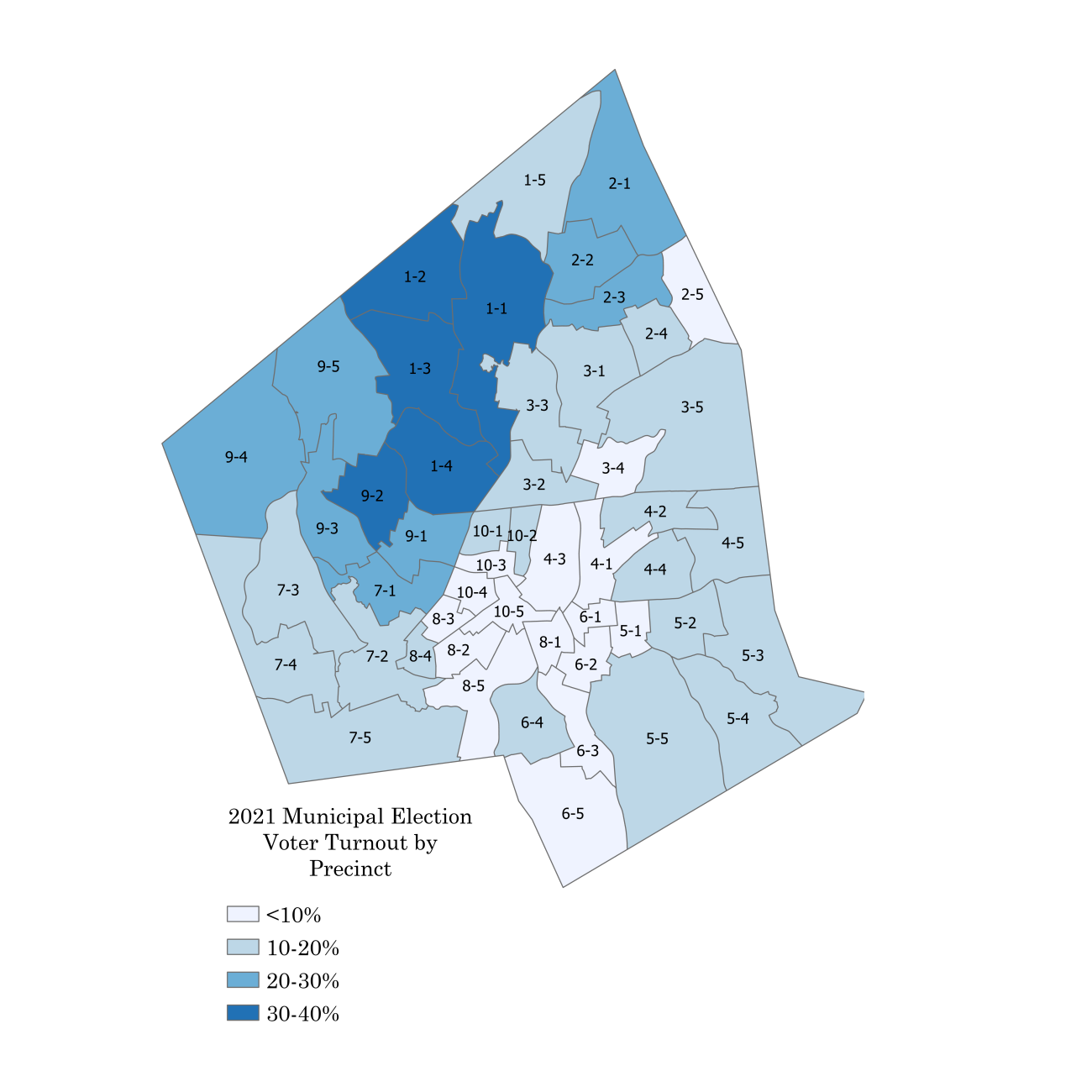
The Worcester Regional Research Bureau is pleased to release Bureau Brief - Worcester's 2023 Election, a Primer.
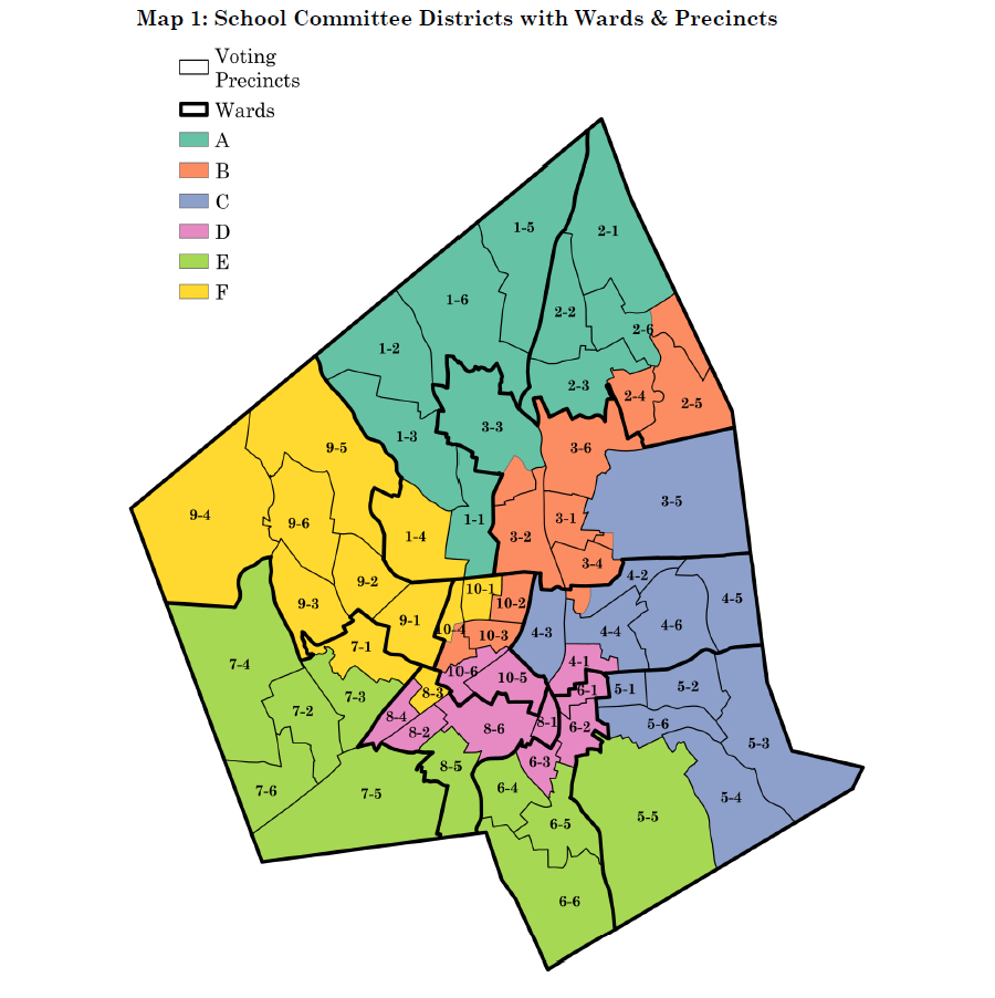
The Worcester Public Schools (WPS) is undergoing an evolution in governance, most notably with the shift to district based representation on the School Committee.
According to the USDA, in 2021, 33.8 million people (including 5 million children) in the United States lived in households that experienced hardships providing enough food.
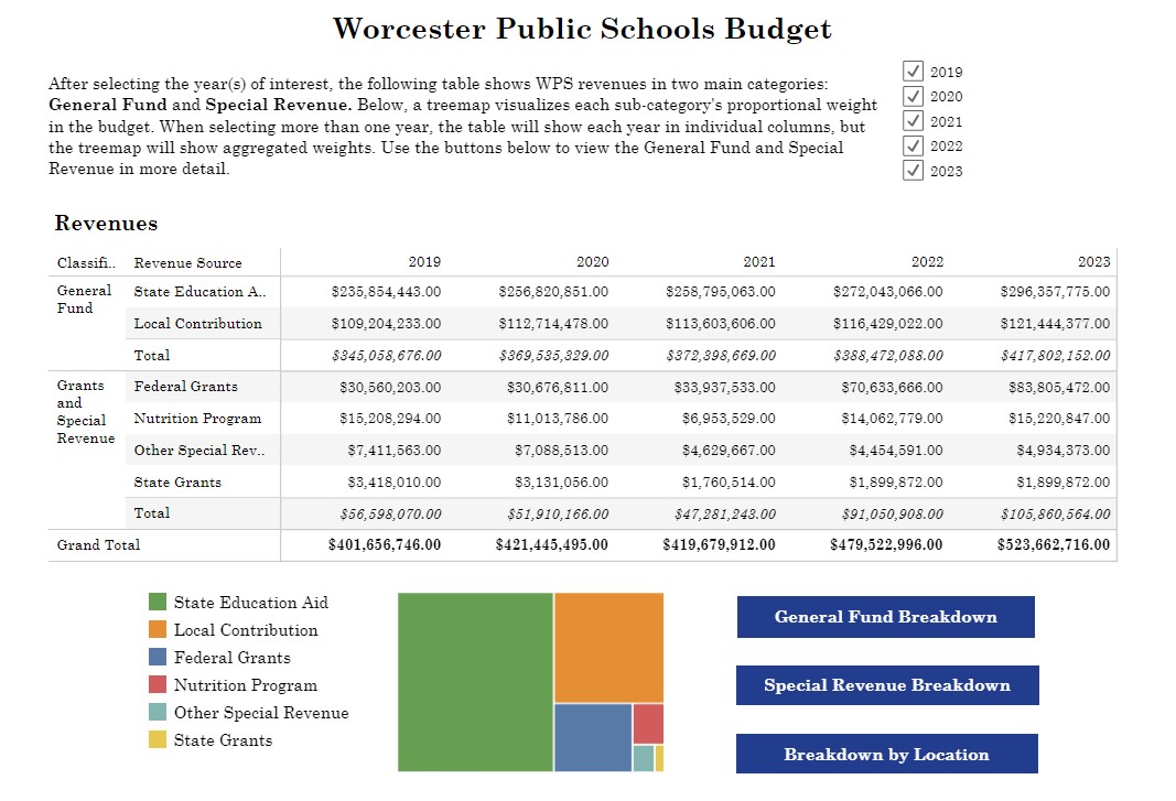
The yearly budget of the Worcester Public Schools is complicated, and necessarily so. With 23,735 students and 5,149 employees spread across 46 schools, there are many moving parts of which to take account.
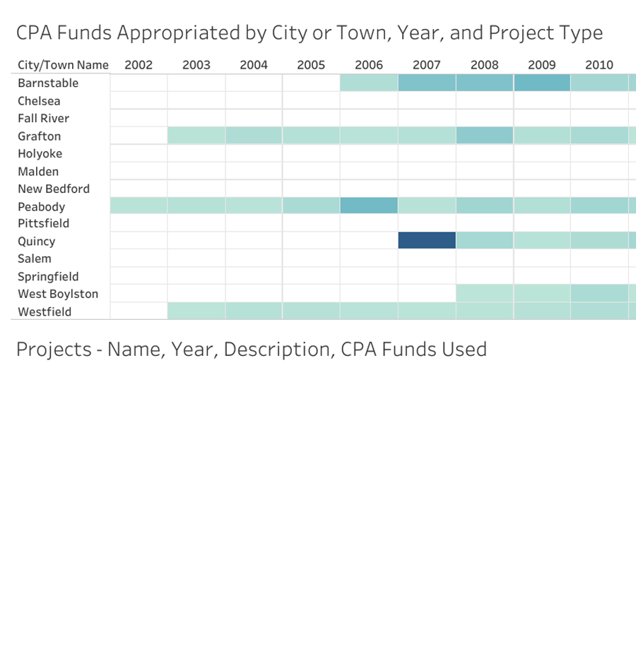
Due to a coalition of local organizations and a vote by the City Council, Worcester voters this November will have the chance to adopt a 1.5 percent property tax surcharge for the purposes of funding community preservation projects.
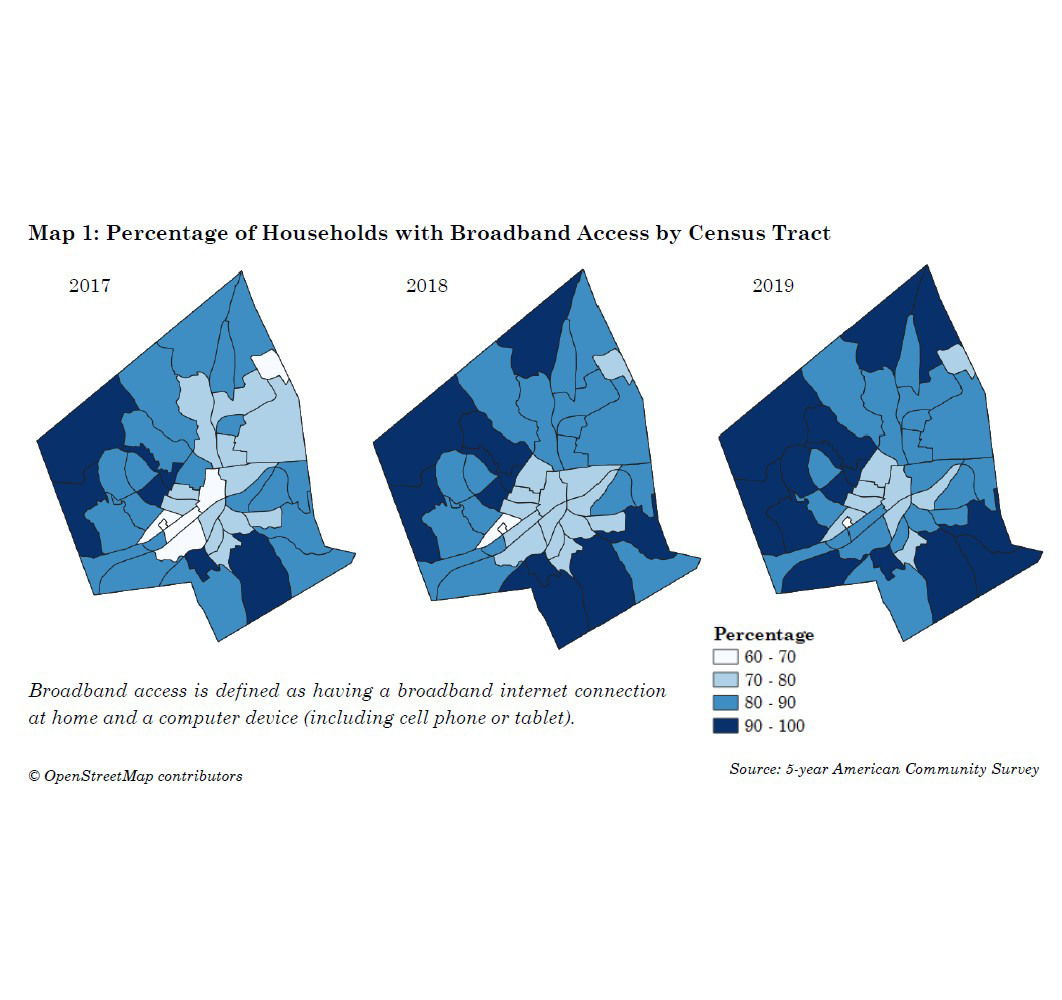
This document expands on that report, by looking at three years of data, examining internet connection speed, and WPS student access.
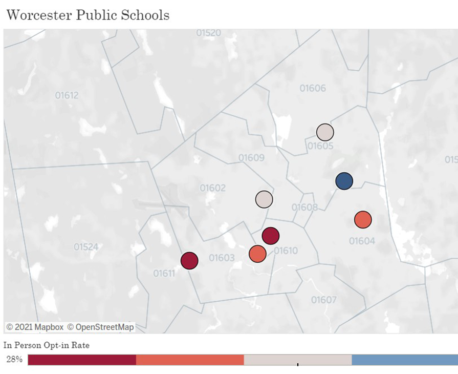
On May 17, 2021, Worcester Public Schools (WPS) will resume offering full in-person learning for grades 9-12.
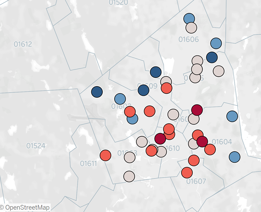
On May 3, Worcester Public Schools (WPS) will resume offering full in-person learning for all grades up to grade 8. Families can opt in to in-person learning or can choose to remain with remote learning.
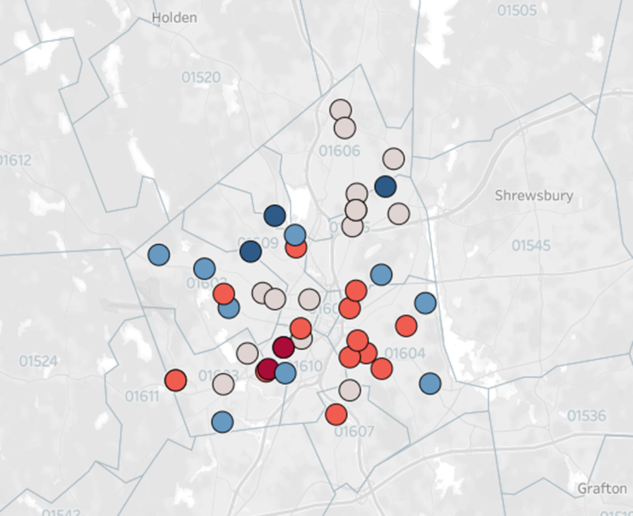
Some parents may be eager to send their children back to school for real or perceived improvements in educational quality, while others may hold back because of a belief that the risk of contracting or spreading COVID-19 remains too high to risk classroom situations.


